Clarifying Value Proposition
Embrace is a B2B company that provides services including team counseling, stress management training, conflict resolution, and team social activities to strengthen remote workers' sense of belonging and retention.
My Role
Company
Team
Time Frame

Overview
Challenge
Embrace has found success connecting with clients through direct marketing efforts. However, many prospective client businesses are missed due to Embrace's lack of a central, informative, and functional site. Our client wanted to make an easy way for prospective businesses to:
Learn about the services Embrace offers
Learn about Embrace success stories through customer reviews
Inspire confidence in Embrace's services
Efficiently connect with the Embrace team for a free consultation
Solution
User testing was required to evaluate to what extent a previous design phase's prototypes met the users' needs. My team and I performed user testing on the Embrace site and based on identified user pain points made the following redesign suggestions come to life:
Updated the Embrace sitemap to meet existing user mental models
Revised information architecture to emphasize Embrace's brand goal
Corrected accessibility issues
We delivered updated high-fidelity wireframes and prototypes to reflect mobile, tablet, and desktop site views. Finally, we provided detailed annotations to ensure a smooth developer handoff.

Define
Team Kickoff
To begin, my team and I held a virtual kickoff meeting to review deliverable expectations and project timelines. We also discussed how we would meaningfully adopt an agile mindset to ensure effective and creative collaboration throughout our design phase.
During this meeting, we also reviewed provided client materials and the previous design phase's site prototype to familiarize ourselves with the existing product.
User Testing
Research Objectives
Before we developed a script, we first defined guiding research questions:
Will users be able to easily navigate the site through the prototype design?
Will the users be able to successfully complete each task?
Will users understand Embrace’s product offerings?
This was an important step because without clearly defining what themes we hoped to address, our script could have lost direction and ultimately resulted in irrelevant user testing data.
Script Development
We developed a 24 question script based on six tasks ranging from identifying the purpose of Embrace to reaching out to the Embrace team for more information.
To identify and correct lingering script ambiguity, we vetted our script with a colleague from a different team. This was particularly important because of the unmoderated nature of our user testing method.
Participant Recruiting
Based on Embrace's target and current user demographics we recruited business owners or team leaders wanting to build a sense of belonging and retention in remote employees.
Methods
All recruiting and testing was performed through UserTesting.com.
Seven unmoderated testing sessions were conducted, generating over three hours of data.


Analysis
User Testing Report
Before analyzing the three hours of data generated from our seven user testing sessions we first met as a group to establish a qualitative data documentation strategy. We decided to record user feedback in a table that delineated responses to each script prompt. Clearly defining our data documentation strategy increased consistency across team members.
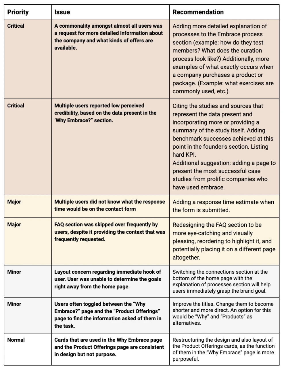
As a group, we reviewed the collected user data and noted areas of wins and areas of friction. We delivered our client a comprehensive User Testing Report including:
A table with pain points categorized as Critical, Major, or Minor with accompanying recommended solutions based on established industry UX/UI patterns, and heuristic principles.
Annotated high-fidelity screens with additional information and specifications.
Redesign
Accessibility Audit
I spearheaded a basic accessibility audit of the existing high-fidelity designs. This was an important consideration to investigate as it would impact all future redesign efforts. Referencing WCAG standards, I identified and addressed the following issues:
Color contrast between the foreground and background did not pass WCAG standards
Button text was not consistent across the site, even when the same interaction resulted in clicking it
Information Architecture
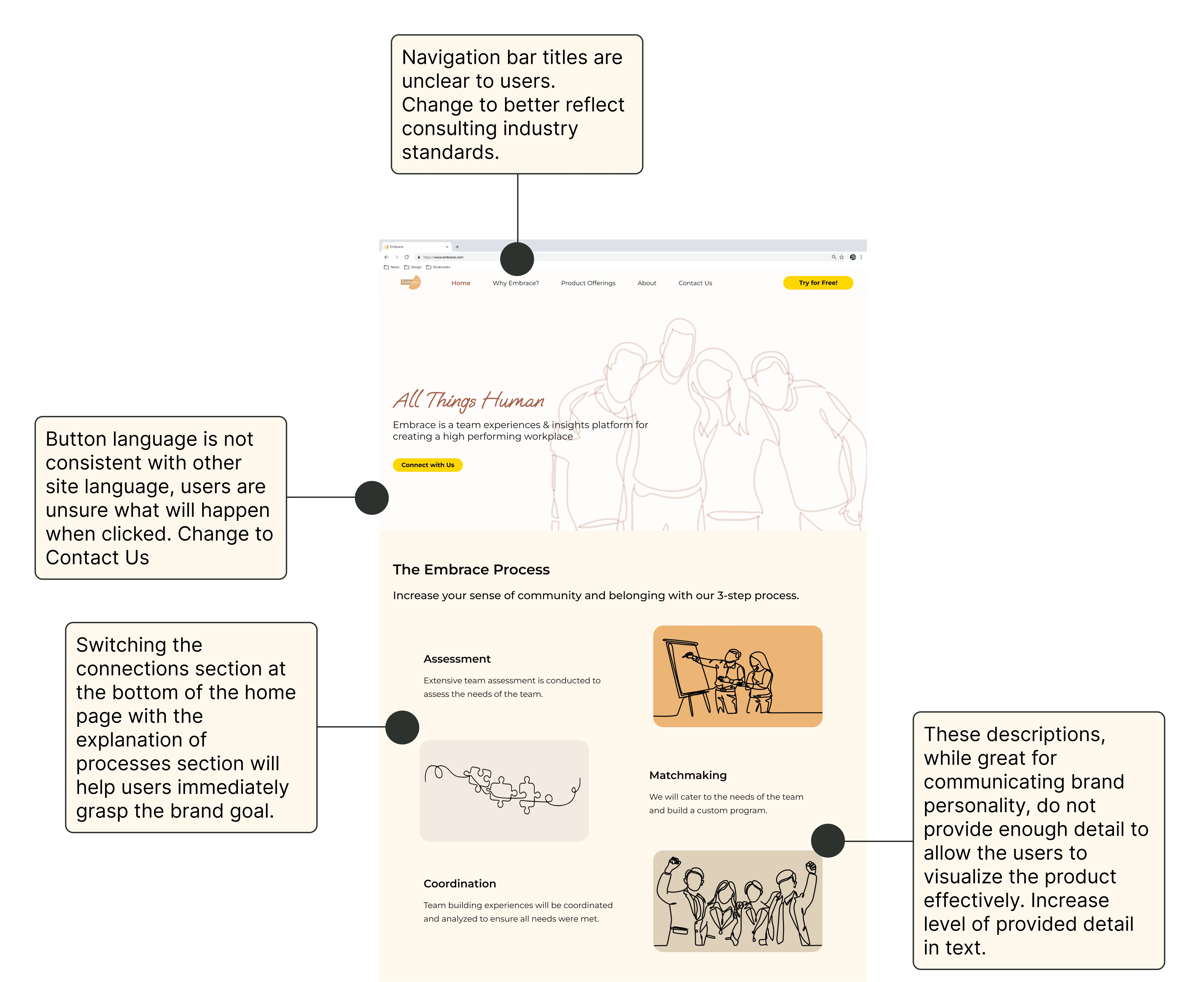
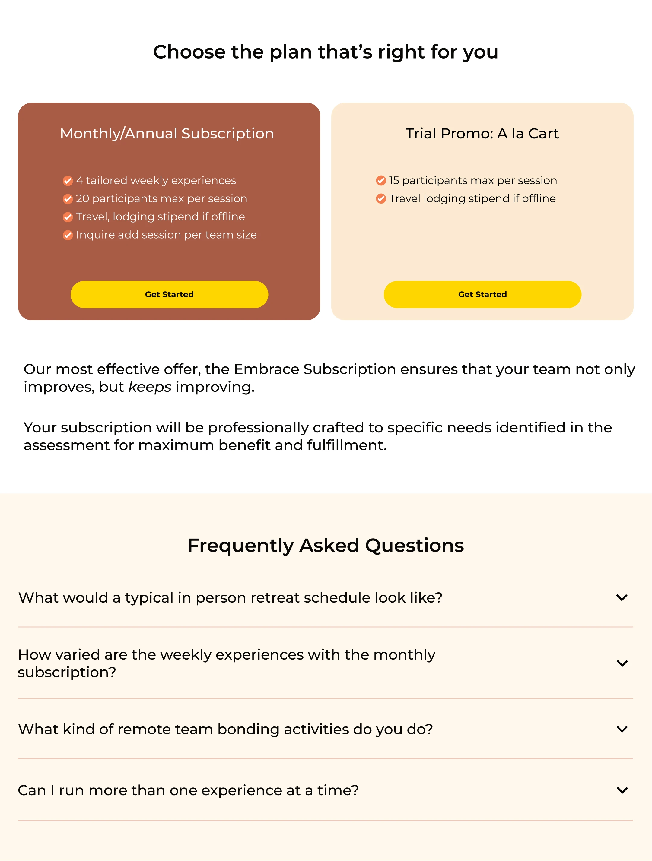
User testing results indicated that users left the site with a positive impression of the product, but at the same time were unsure if Embrace would be a good fit for their needs. Users were left uncertain of exactly how Embrace delivers on its promises. These results indicated that the site effectively conveyed brand personality but was less effective at relaying specific service details. We identified that this lack of certainty was in large part due to:
Insufficient details provided in the site copy
Users not readily finding important information already present on the site
To combat these issues we increased site copy details and reassessed the site's information architecture by 1) increasing navigation bar clarity and 2) improving visual hierarchy.I developed a user testing script focusing on five tasks:
Navigation Bar
We updated the navigation bar language to better reflect tech consulting industry norms. Doing so will build on users' previous experience and mental models and increase their success in efficiently finding relevant information.

Visual Hierarchy
We evaluated each page's visual hierarchy to assess what information would naturally be emphasized to the user. In the case where areas of key information were not being emphasized we redesigned accordingly by employing a variety of visual hierarchy principles including size, position, or in the case of the FAQ section to the right, color contrast.

Reflection
Learnings
Redesigning Embrace's website was a great example of the importance of the power of information architecture. Our user testing of the original designs demonstrated the design's effectiveness at conveying brand personality and sparking user intrigue. Still, users were left unsure of precisely what working with Embrace would really entail. We found that many of the questions users voiced were addressed on pages of the site the users had visited, but did not stand out to users. By evaluating and redesigning the site's information architecture we increased the site's emphasis on services offered to better reflect users' needs.
Next Steps
Designing new pages was outside of this phase's scope so we were unable to design a "Works" page featuring case studies of Embrace's past client success stories. I think this would be an impactful addition to the site because users could easily learn more about Embrace's successes, and see their services in action. As discussed above, users left the site excited about the product but unsure of whether it would be a good fit for their company's specific needs. We addressed this concern by updating the site's copy and improving the site's information architecture but adding a Works page would further improve user confidence, and reflect patterns common to the consulting industry.
To design a "Works" page specific to Embrace's needs, I would begin by discussing past successful business collaborations with the client as well as conducting user interviews with questions specific to company owners' and team leads' experience reading customer reviews and case studies.

