Increasing Readership
Mistake House is a digital literary magazine showcasing student short stories, poetry, and photography in annual online publications. In addition to providing a platform for artistic experimentation and expression, each Mistake House issue also spotlights two professional writers, providing readers with interviews and selected works.
My Role
Company
Team
Time Frame
Overview
Challenge
Despite the compelling nature of Mistake House’s issues, the between May 2021 and December 2022 site’s average bounce rate was 58.2%, and the average time spent on a page was 1 minute 34 seconds. Both of these metrics led stakeholders to question whether the site design was promoting an enjoyable reading experience, ultimately impacting the magazine’s readership, donations, and reach.
Solution
By conducting a competitive analysis, secondary research, and user testing we identified several key issues with the original site's readability and site map that impacted user experience and ultimately warranted a site redesign. Our redesign prioritized:
Ensuring blocks of text matched industry and WCAG2 standards to improve user's ability to read lengthy articles
Improved CTA placement and design to prompt relevant next actions
Modernize UI to increase impression of professionalism and trust
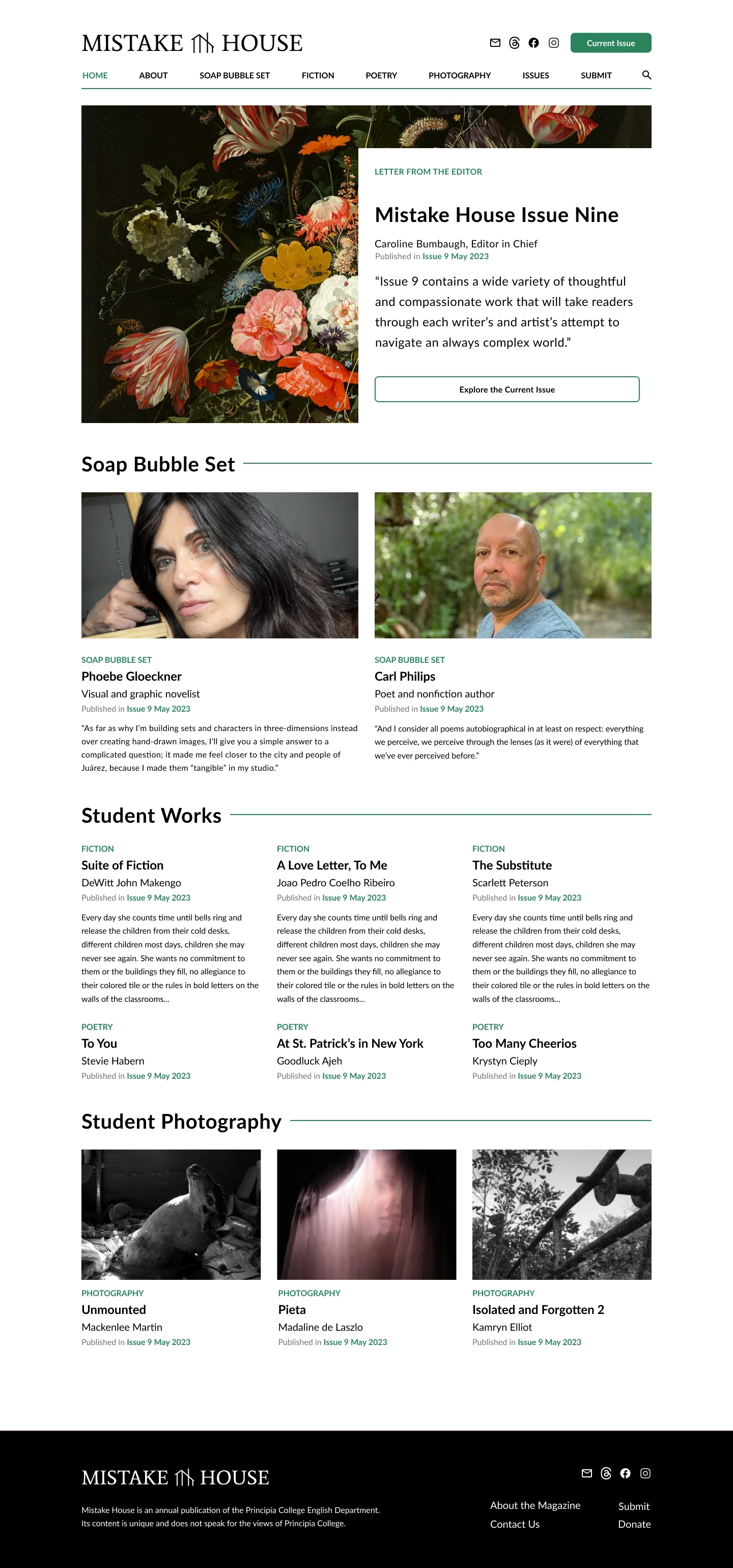
Clarify purpose of the Soap Bubble Set, a unique section of each Mistake House edition featuring professional writers/artists
In the future we plan to conduct additional user testing to evaluate user experience of Mistake House 2.0.


Research
Market Research
I began by performing market research to identify the purpose, trends, and publishing demands of the literary magazine industry.
Secondary Research
Next I performed secondary research on digital (desktop and smart device) readability UX. By leveraging findings from white papers and academic research articles I was able to gain insights from methods that would have been beyond the Mistake House Redesign project's budget including eye tracking.
Competitive Analysis
I also reviewed seven publications from other undergraduate institutions to analyze existing UX/UI patterns in the digital literary magazine landscape and common industry trends.


User Interviews & Surveys
Focused Questioning
I then conducted user interviews and surveys. This allowed me to evaluate specific questions for our targeted user base including:
How do users discover new literary media?
What devices and apps do readers typically use to read different types of literary works?
What type of experiences do users have with literary magazine submission processes?
I consolidated findings from these user interviews and surveys through affinity mapping and personas development.


User Testing
Script Development
It was now time to carry out user testing to identify specific areas where the Mistake House website was serving users well, versus where users were getting lost or frustrated.
I developed a user testing script focusing on five tasks:
Home page exploration
Finding a soap bubble set interview
Reading a fiction piece from the current issue
Submitting a literary work
Making a financial contribution
Conducting Testing Sessions
I carried out user testing with five individuals (identified through the previous user survey). Our user testers ranged in experience with literary magazines, from casual reader to former editor of a similar publication. These interviews were conducted remotely and lasted about thirty minutes each. I summarized findings in a table to identify emerging themes and takeaways, and ground team discussions on what areas would be most important to prioritize in the redesign.


Redesign Priorities
Clarifying Purpose of Soap Bubble Set
The strongest theme that emerged from our user testing was that the purpose of a key element of the Mistake House publication was unclear to our users. The Soap Bubble set is a segment of each Mistake House Publication that showcases two professional writers or artists, through interviews and a selection of their work. Despite being a unique and compelling feature of the Mistake House, users were unsure of its purpose sometime even after the course of the entire user testing session.
Improve Reading Experience
Based on secondary research materials including the Web Accessibility Initiative Visual Presentation (Level AAA) guidelines, the Mistake House articles exceeded the recommended 80 words per line, and had line spacing below the recommended level of 1.5.
Modernize UI and Brand Identity
Overall, users had positive connotations with the existing Mistake House. Still it was clear through the competitive analysis performed earlier in the research phase, the existing Mistake House UI was not reflective of modern publication UI trends, which in some cases was having UX implications in the case of readability discussed above. Redesign efforts therefore involved updating the Mistake House brand identity and UI to better align with the Mistake House's guiding ethos:
"We embrace the moments when creative accidents meet hard work and provide a necessary excuse for rejuvenation."
Reflection
Next Steps: User Testing
Moving forward we plan to do another round of user testing to evaluate the effectiveness of the updated Mistake House designs, with the following driving research questions:
Has user understanding of the Soap Bubble Set's purpose improved?
How has time on task for navigating to specific articles changed from original site implementation to redesigns?
Has how users decide which issue to explore changed and how?
How has casual browsing trends (moving from article to article unprompted) changed?
Lessons in Readability UX
This project was particularly interesting to me because there was such a focus on the UX of how people read in digital platforms. Diving deeply into secondary research on the subject really expanded my understanding of web and mobile based reading patterns and accessibility considerations that I have already applied to other projects!

